Twisted Arrow Review – Oculus Rift
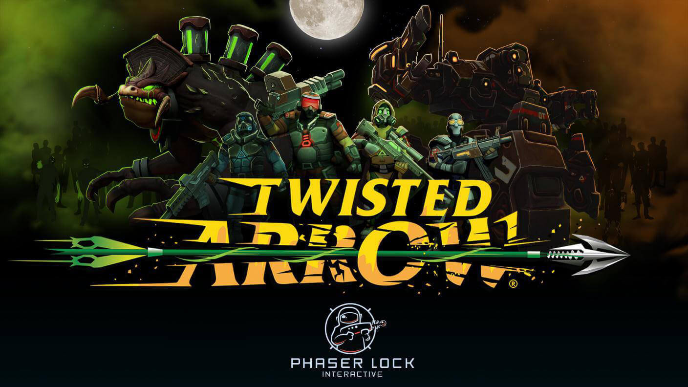
Despite the age old idea that you should not judge a book by it’s cover, and by extension, a game by it’s cover art, I nevertheless find myself doing that anyway a lot of the time. I think that adage came to be before a large portion of marketing budget went in to designing eye catching covers. I only bring this up because everything about the Twisted Arrow store art caught my eye, from the yellow and green colour scheme, to the font, to the way the word arrow is being busted up by an arrow, it just screamed production value. I’ve felt this way before though and wound up less than enthused with the product, but I’m happy to say Twisted Arrow is so very close to being every bit as good as I expected it to be.

Recent Comments